From a lengthy sales process to a real-time design experience.
How I transformed a manual interior sales process into a real-time design experience.
- Role
- UI/UX Designer
- Responsibilities
- Research, user flow mapping, wireframing, visual design, and prototyping
- Primary user
- In-store sales executives
- Outcome
- 3-4 days to under 30 minutes
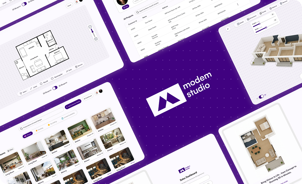
Modem Studio is a premium interior design and furniture manufacturing brand. They operate through physical stores where customers can explore design setups and discuss ideas with a salesperson.
But while the brand looked modern, their sales process wasn’t. Everything was manual — from collecting blueprints to waiting days for the design team to send visuals. This often meant delays, lost opportunities, and frustrated customers.
I joined the project as the UI/UX Designer, working closely with the client and their sales team to understand how we could digitize their in-store process without losing the human touch.
My responsibilities included research, user flow mapping, wireframing, visual design, and prototyping.
For confidentiality, the brand name, branding, and a few design elements have been modified while keeping the core concept intact.
The Challenge
The existing process required customers to bring physical floorplans, which salesperson would send to the design team. It took days to create a layout or interior proposal — often causing potential clients to lose interest before they saw anything tangible.
There was no system to:
- Instantly visualize floorplans in 3D
- Showcase trending design templates
- Save customer data for follow-ups
- Collect payments or approvals digitally

So, I asked myself:
How might we enable Modem’s sales team to turn a customer’s floorplan into an interactive, real-time design experience — right at the store?
Target Users
- Sales Executive (Primary User)
- Needs a fast, impressive way to present interior options.
- Wants to close deals without waiting for designers.
- Feels pressure to keep customers engaged.
2. Customer (Secondary User)
- Often unsure about how the final design will look.
- Gets overwhelmed with too many options.
- Values transparency and trust before making a payment
Research Approach
To understand the full workflow, I:
- Interviewed sales staff to learn what slows down their daily operations.
- Observed how customers interacted in-store — especially what moments led to hesitation and drop-off.
- Analyzed competitors like Super bolter to see how digital visualization tools bridge imagination.
From these, I realized the biggest gap wasn’t just time — it was the lack of visual confidence. Customers wanted to see what they were buying before committing.
Design Goal
I reframed the client’s vague request for “a faster way to operate” into a clear design mission:
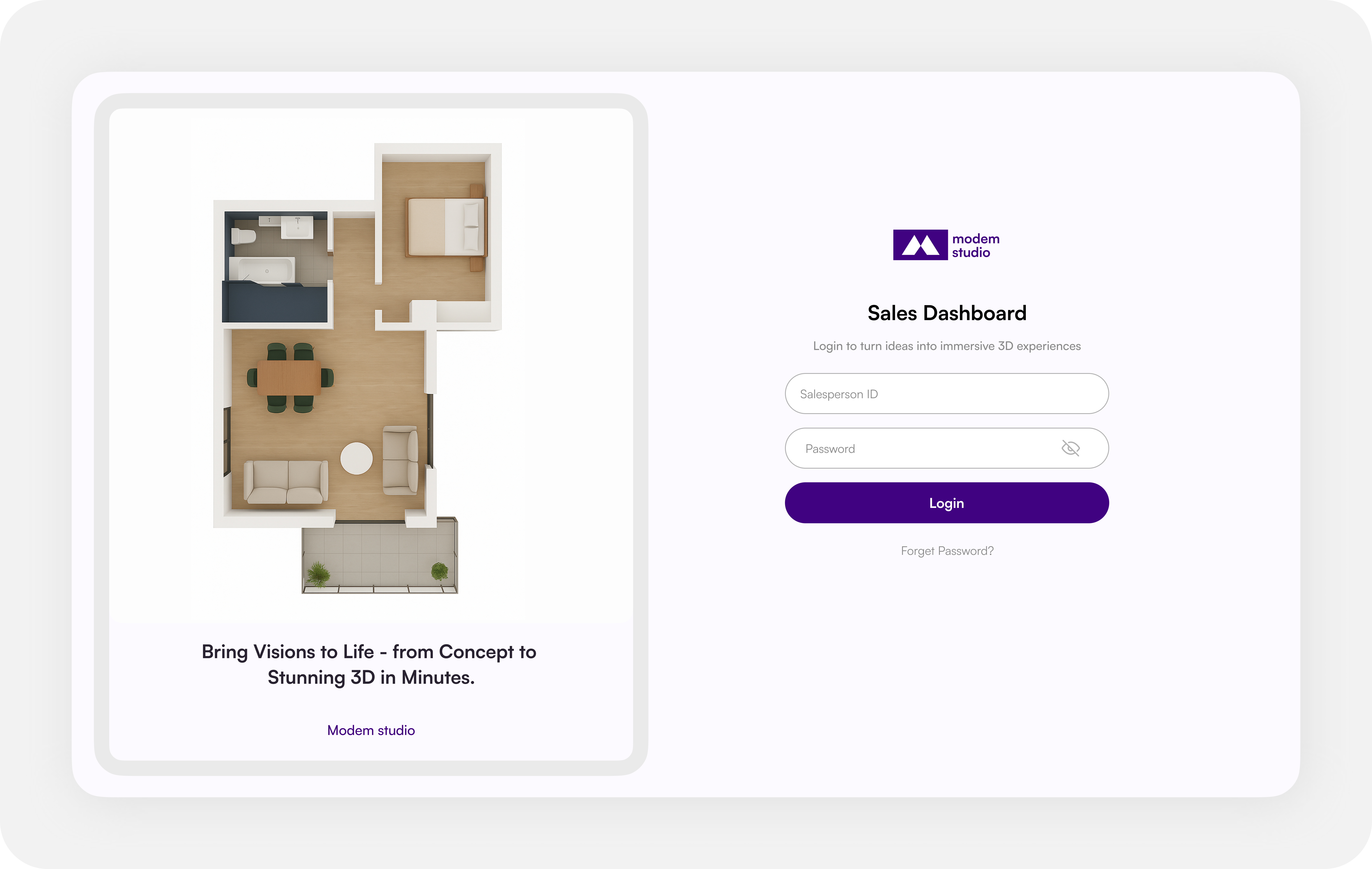
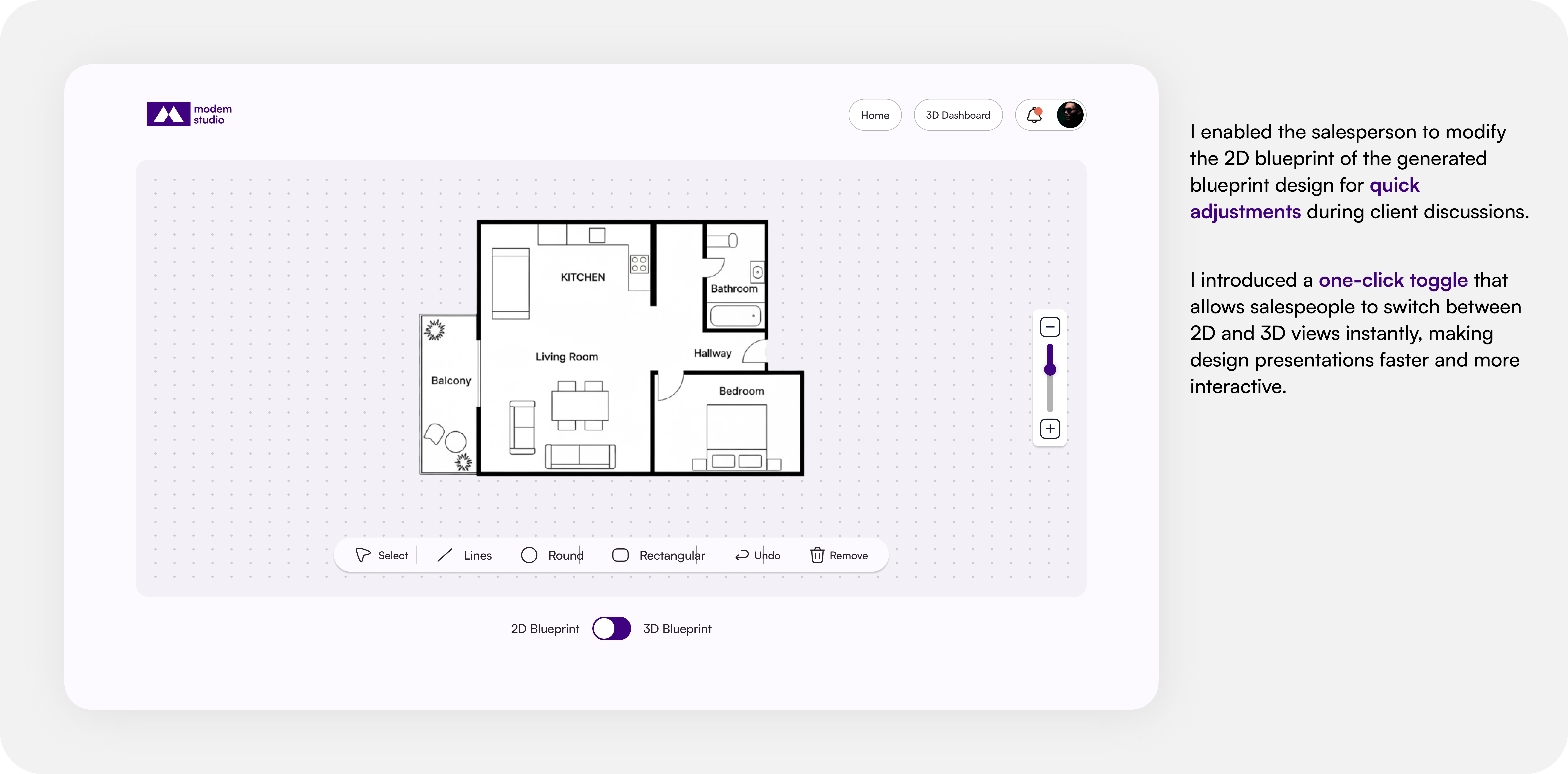
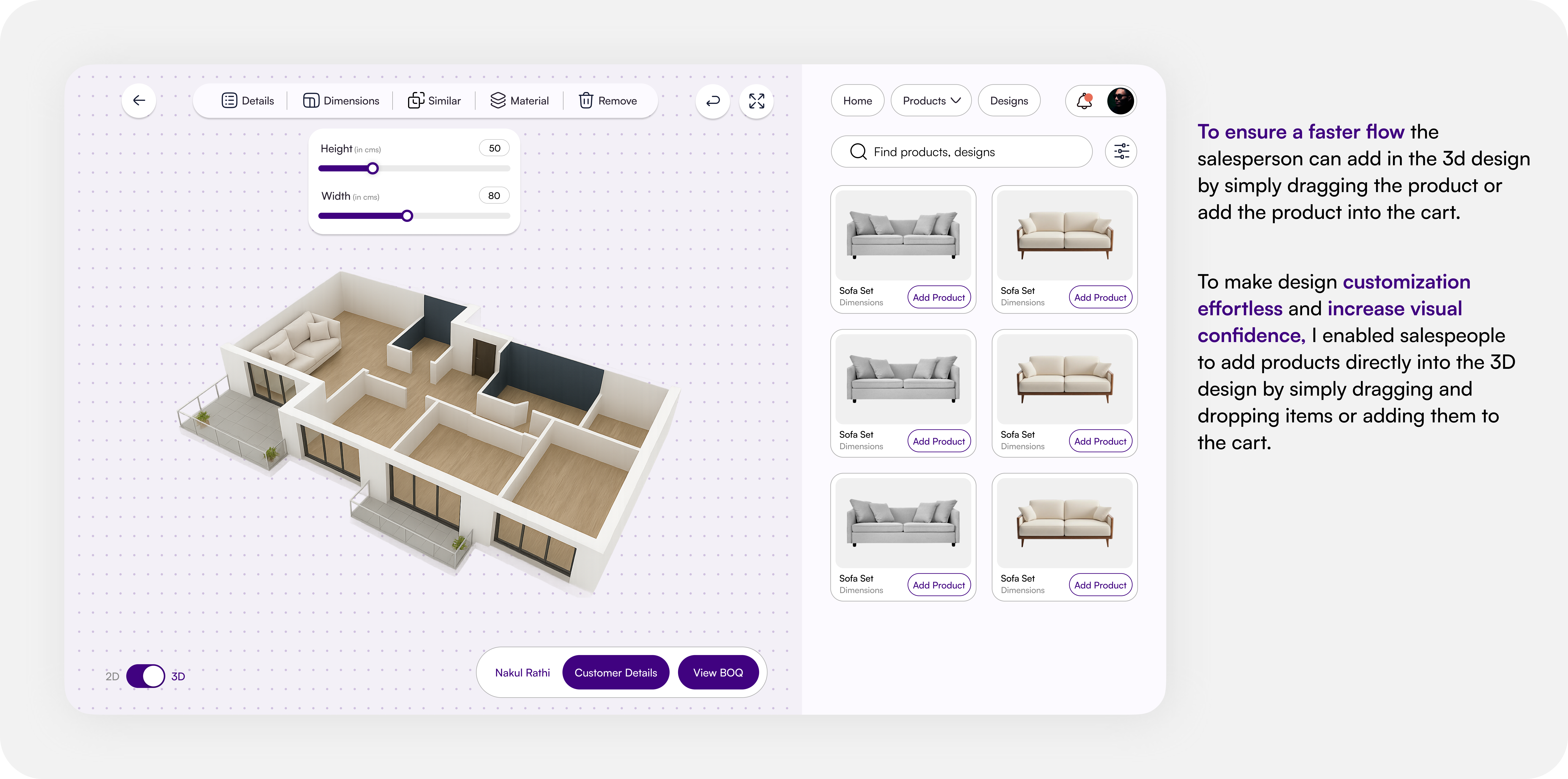
Design a Sales Dashboard that empowers salesmen to instantly visualize customer floorplans, present design options, and secure advance payments — all in one real-time interface.
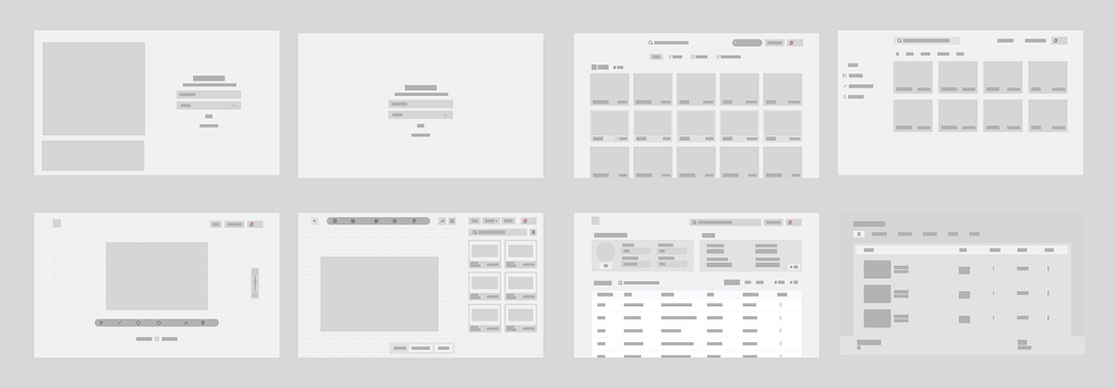
Wireframing & Structure
I focused on clarity and focus:
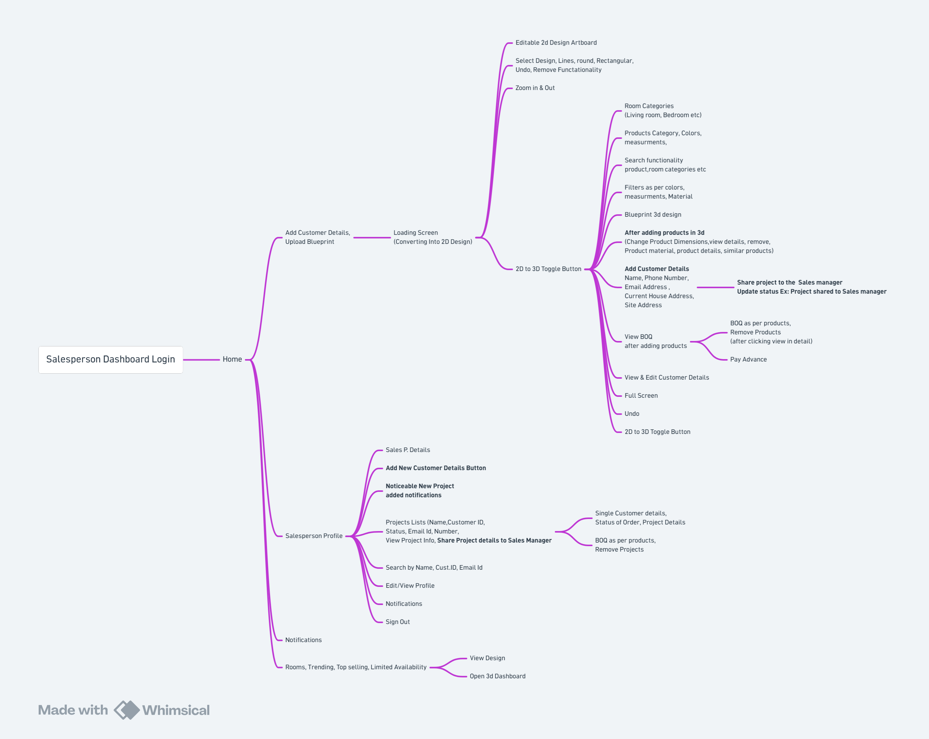
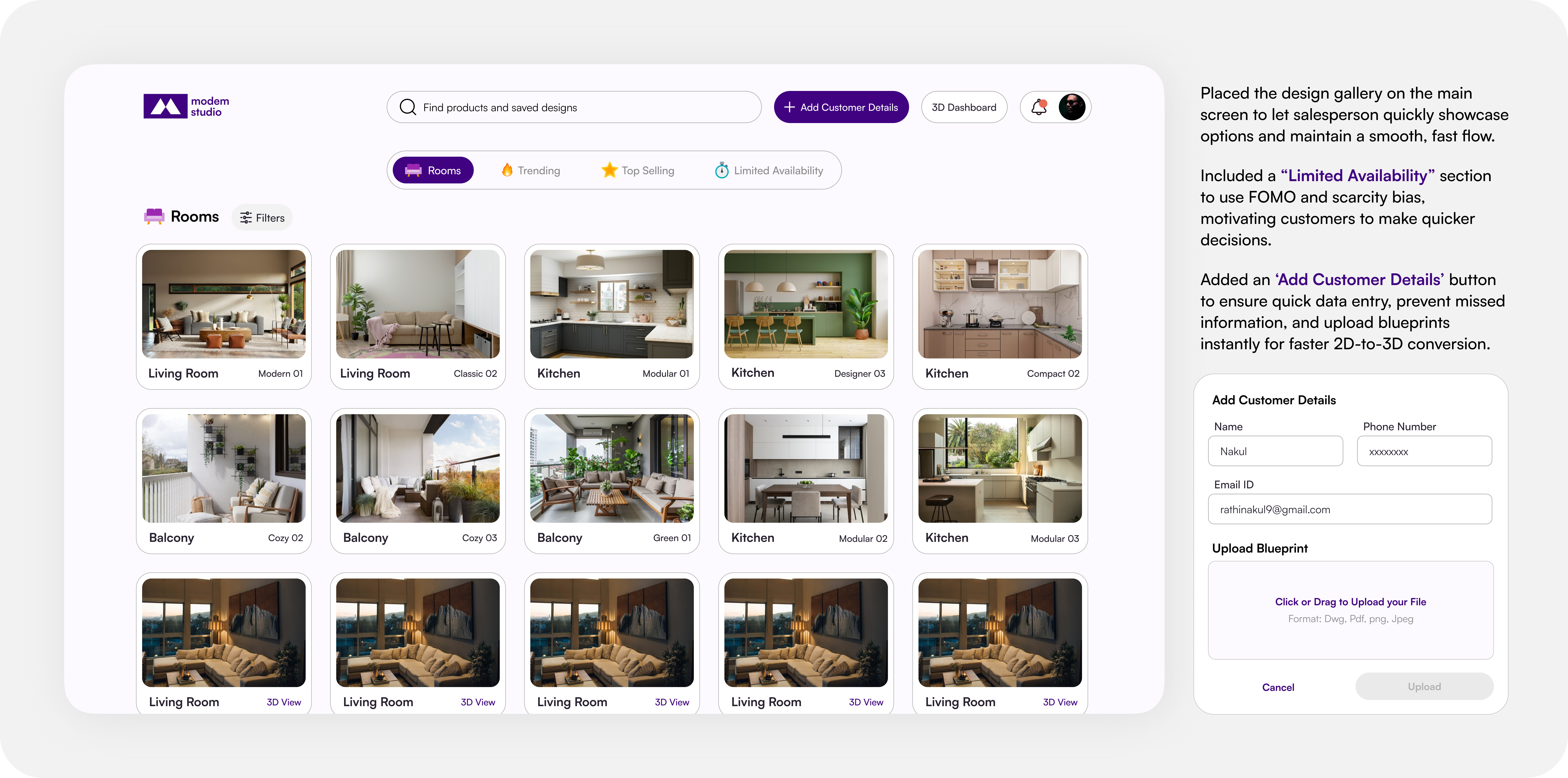
- A clean dashboard showing Trending designs, and quick access to Upload Blueprint, Add Customer Details.
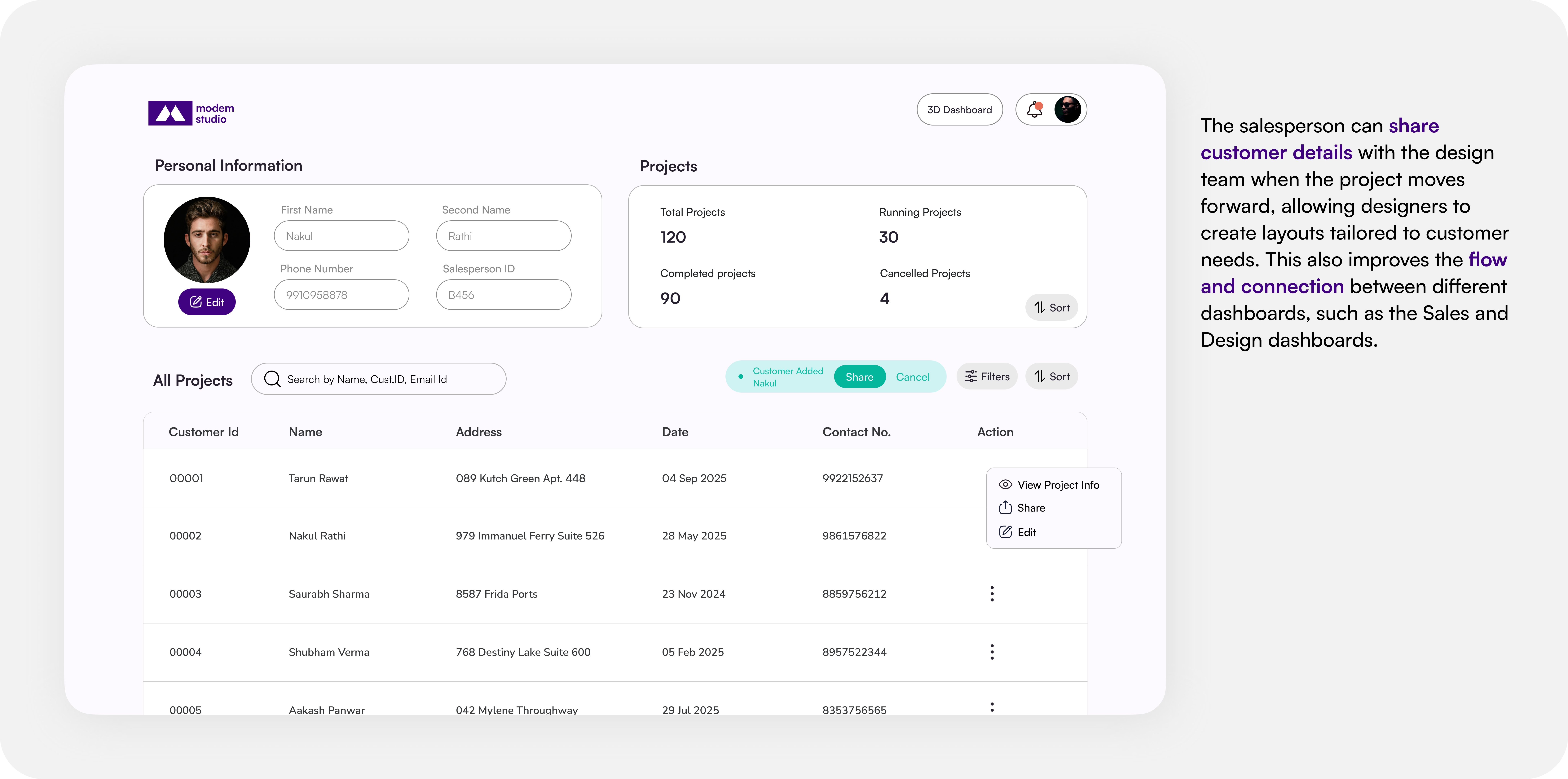
- A Salesperson Profile section showing customer list, ongoing projects.
- A side panel for trending designs, materials, and color palettes.
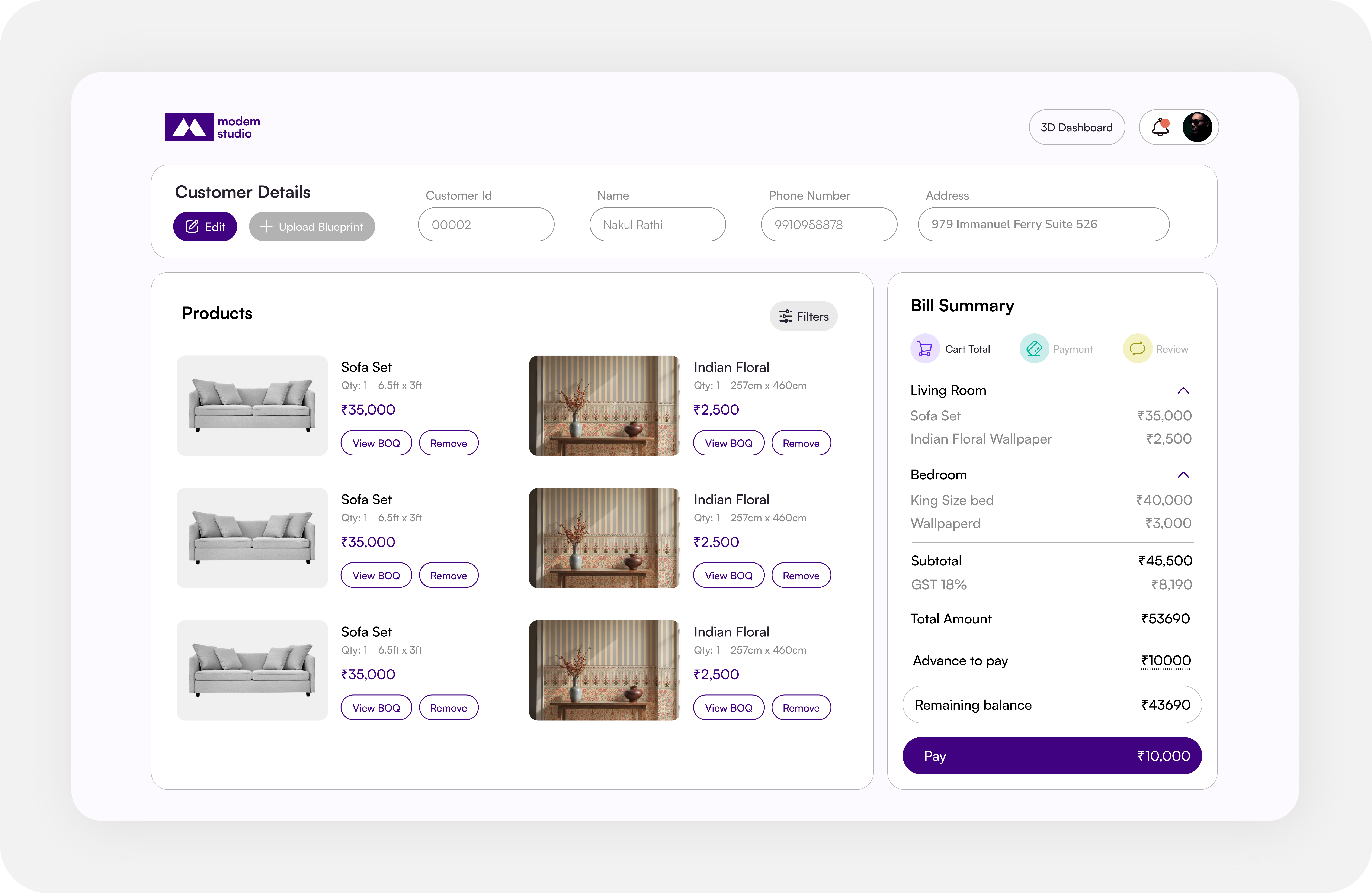
- Integrated payment module for on-the-spot advance collection.
Dashboard Designs
Expected Impact
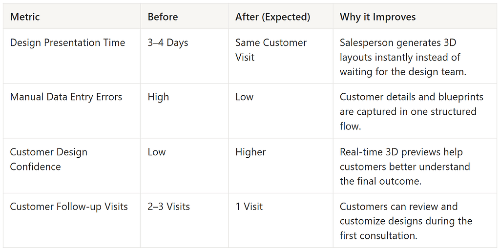
The following estimates are based on comparing the client’s existing manual workflow with the proposed digital workflow.
Psychology & Design Principles
To make the interface feel intuitive and persuasive, I relied on a few behavioral design principles:
- Hick’s Law: Limited the number of visible design options on homepage to prevent choice overload.
- Scarcity Bias: Highlighted “Trending Now” designs to create gentle urgency and leads to faster decision making.
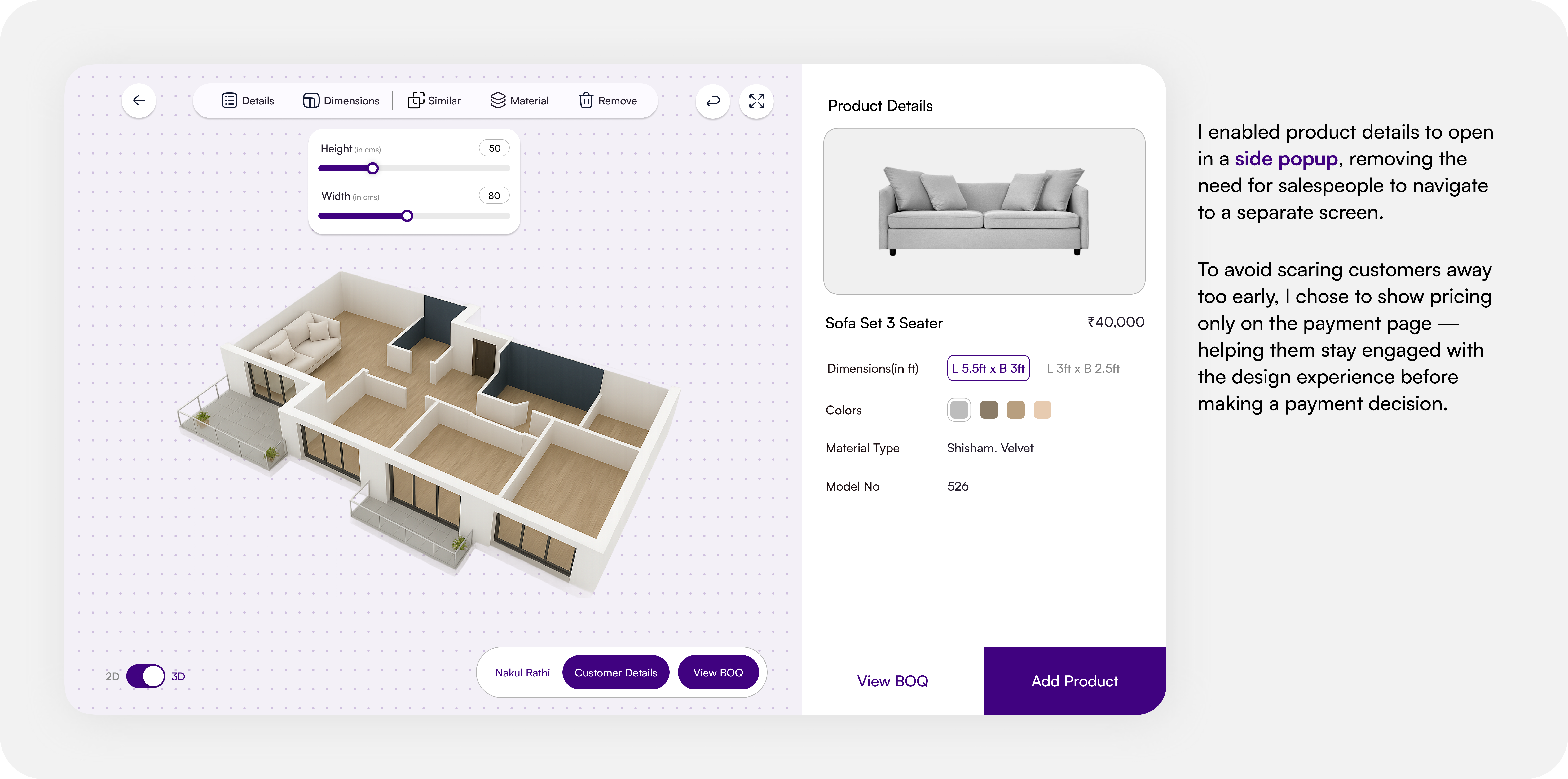
- Visibility of System Status: keeping users oriented in one flow(opening the side popups for product details).
- Usability & Error Prevention: Designs should help users avoid mistakes and recover easily. By placing the ‘Add Customer Details’ option on the home screen, I aimed to prevent salespeople from forgetting to capture essential customer information.
- Consistency & Communication: Systems should behave predictably and maintain flow across screens. Allowing salespeople to share customer data across dashboards ensures continuity and a smoother handoff between teams.
- To keep users engaged and focused on the design experience, pricing is revealed only on the payment page rather than on BOQ screens — reducing the risk of customers abandoning the flow due to early price exposure.
Every design decision was guided by core UX principles focused on speed, clarity, and customer trust.
Outcomes
- Faster Sales Cycle: Before, creating and sharing designs took days. With the new dashboard, sales teams could generate visual layouts instantly — reducing the design visualization turnaround time from 3–4 days to under 30 minutes during customer visits.
- Improved Customer Confidence: The real-time 3D visualization helped customers understand how their space would look — reducing hesitation and building trust before payment.
- Streamlined Internal Workflow: Once a customer approved a design, sales teams could instantly forward it to the design department through the system — eliminating manual back-and-forth.
- Increased Transparency: The integration of progress tracking and a centralized dashboard meant every stakeholder (sales, design, manufacturing) had visibility into each project’s status.
- Enhanced Sales Experience: Salespeople now had a tool that felt modern, reliable, and aligned with Modem Studio’s premium brand image.

Thanks a lot for reading! My main goal in this project was to turn real challenges into simple, human-centered solutions — drop some 👏 if you liked it!